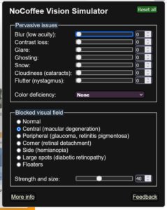
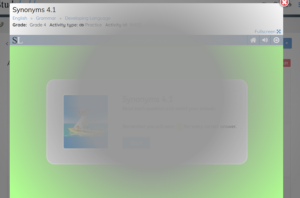
I used the NoCoffee Vision Simulator to evaluate the experience of people with various visual impairments in their use of the website Studyladder. The website continued to be usable with any of the changes I made, as long as the impairment was not very severe. I found turning up the blur over level 5 made most elements unrecognizable. The website includes a lot of spacing, with large bold font sizes which made most of the activities on the site accessible to someone with mild impairments. I found low contrast, glare, snow, and colour deficiencies to make minimal difference. Blur, and ghosting had very severe negative effects, as did the macular degeneration setting. A student with macular degeneration would have to look at the side of the screen or back and forth in order to see the main activity.
NoCoffee settings:

 View of screen using macular degeneration setting.

Jim MacLean
February 21, 2022 — 8:43 pm
Hi Geoff
Thanks for your post, especially your posting of the screen shots. I also found my use of no-coffee surprising. It really increased by appreciation of the need to make materials as accessible as possible.
Thanks
Jim