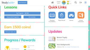
As I am a classroom teacher and nearly all of my instruction is face-to-face, I will evaluate a website that I use to support my teaching. The website is called Studyladder, and it is a free site that allows teachers to manage a class and assign activities designed to teach and reinforce learning across the curriculum.

If I feel that students would benefit from additional practice in a certain curriculum area, I can search for appropriate modules and assign them to my students. I can also form sub-groups and tailor to specific student learning needs.
In evaluating Studyladder for accessibility, it becomes clear that the site was not designed for students with visual impairments. Students with hearing impairments can use the site with less difficulty, but will encounter a few modules that are not as accessible.
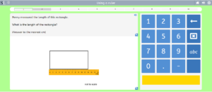
Navigation on the site can be accomplished through tabbing on the home screen. While working on a module, however, the tab function will not select any of the answers. A mouse or touch screen computer or tablet would be necessary in this case. The buttons to select answers are quite large, so students with fine motor difficulties will still be successful.
Text is a good size, and contrast between elements is good. Colour is used consistently, ie. the buttons for selecting answers are always the same colour. Correct answers are always one colour, and incorrect answers always another. Answer results are also supported with consistent sounds.
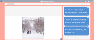
There are buttons that will read any text that is displayed. Visually impaired students will not be successful as many of the tasks involve video and pictures that are not described with audio. Students with hearing impairments will have difficulty accessing videos that are not transcribed.


