Out of curiosity, I thought I would examine the British Columbia Government curriculum website to see how it measures up against the WCAG guidelines.
The BC Curriculum link I used can be found here.
The guidelines for accessible website content are measured using the POUR principles, which are as follows:
Perceivable – Is the content able to be perceived by the user? Is content available to be perceived using sight, sound, or touch?
Operable – Is the website organized so that it is easy to navigate?
Understandable – Is the website structured predictably, with menus, links, etc.
Robust – Is the website accessible on many different devices?
 My first experiment with the website was to see if I could navigate through it by tabbing, and without using a mouse. I was surprised to see how easy it was, and how the website was designed to make tabbing easy.
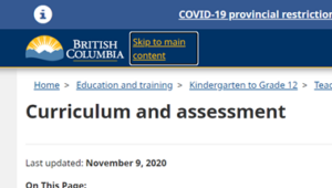
 After tabbing through the covid banner you can skip to the main content.
 Tabbing further brings up an accessibility information link.
Selecting that menu brings up compliance information on accessibility, and that the site complies with WCAG 2 guidelines:

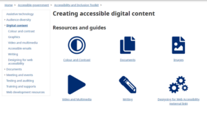
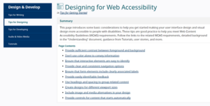
If the user would like further information on accessibility features of the site, or on how to make their own site more accessible, there is a link which takes you to an external link. Clicking on external link:

I would say that the website is highly operable and easy to navigate. I also discovered that a user could SHIFT+TAB in order to go back up the page. Colours and buttons are standardized. The website uses bullet points and underlined hyperlinks. Titles and headings are standardized, and all pages are easily tabbed through. With these features, I found the site to be very operable.
Understandability:
While the website is designed for teachers, it is understandable due to the use of precise and succinct language use. When a user requires more information, there are links which open up further explanations, and resources.
Perceivable: The website is clear visually, with black font on a white background. The site uses blue background colour with dark blue being used with titles, down to lighter shades of blue for headings and subheadings. I experimented with trying to get the website to read to me, but could not get it to work. Alternatively, I could download content in .pdf and then use a Chrome extension for text-to-speech.
The content is Robust. The site allows three different formats for downloads, and is accessible on my phone, iPad and computer.
References:
W3C Web Accessibility Initiative (WAI). (2018, June 22). Web content accessibility guidelines (WCAG) overview. https://www.w3.org/WAI/standards-guidelines/wcag/

Jim MacLean
February 21, 2022 — 8:49 pm
Hi Geoff
Excellent and thorough review of the website. I am pleased to see our government website is so well laid out. Though I might wish my curricula could be done as well (lol). Interesting comment about the text to voice aspect. Too bad an extra step is needed.
Thanks for the info.
Jim